
Graphic
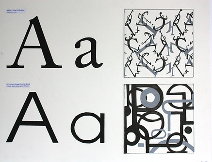
The Glyphs
The main goal of this exercise was to draw specific glyphs from a typeface while staying true to the spirit and characteristics of the font.
I had to pay close attention to the differences between uppercase and lowercase glyphs.
Beyond the accuracy of the letterforms themselves, the challenge was to use them in a way that created meaningful compositions — both through layout and typographic choices.

ITC Avant Garde Gothic Book
Adobe Caslon Pro Regular
Inspired by the dancers' movements


Color
This project explored both an intuitive and theoretical approach to color — and, more simply, the development of chromatic sensitivity.
The exercise involved creating five gouache studies (color sketches) based on the same reference image: a landscape painted by Jean-Baptiste Corot.
Each study was accompanied by tonal value swatches, which allowed me not only to analyze the color ranges used in each version but also to identify and define the key hue variations.
Overall, the goal of this exercise was to explore how light and atmosphere can transform an image. By controlling light intensity, I aimed to give each study its own distinct mood — capable of evoking a specific atmosphere, moment in time, or emotional state.

